Wes Anderson is one of the most visually distinctive directors working in contemporary cinema. His films are immediately recognizable from a single frame — a level of visual consistency that very few filmmakers achieve across an entire career. Understanding his cinematography means understanding how a director can use the camera not just to capture a story but to construct an entire emotional universe with its own internal logic and aesthetic rules.
The conversation around Wes Anderson’s visual style often focuses on surface qualities — the pastel color palettes, the dollhouse symmetry, the precise compositions. These observations are accurate but incomplete. What makes his cinematography worth studying is not the individual elements but how they work together to create a specific relationship between the audience and the film’s world.
The Geometry of the Wes Anderson Aesthetic
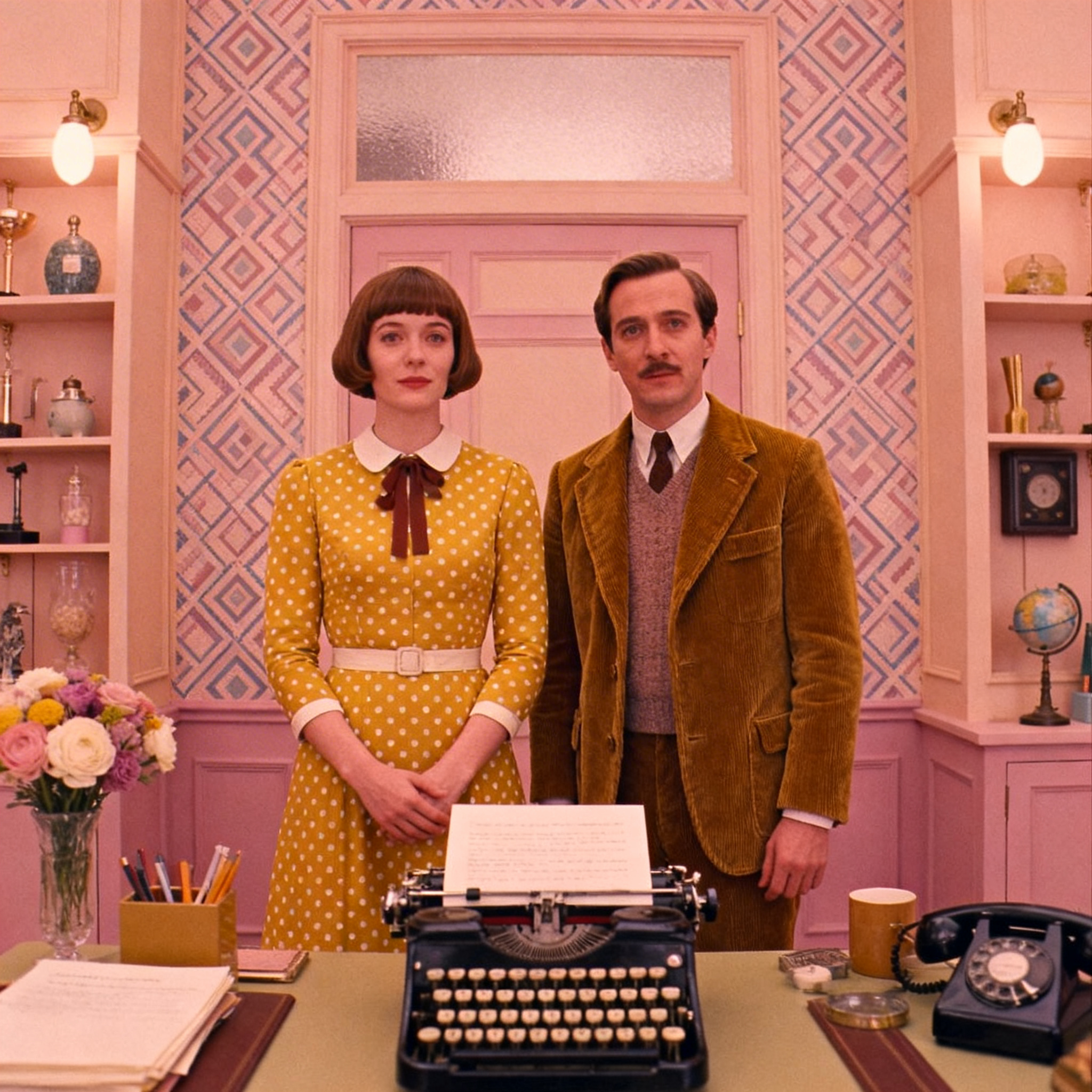
The defining characteristic of Wes Anderson cinematography is symmetry. His frames are organized around a central axis, with visual elements balanced on either side. Characters face the camera directly. Buildings are shot from dead-on. Objects are placed with deliberate precision within the frame.
Symmetry in Wes Anderson’s films is not decorative — it is a philosophical statement. By organizing the visual world with this level of order, Anderson creates environments that feel constructed, curated, and faintly artificial.
This artificiality is not a weakness. It is the entire point. Anderson’s films exist in a heightened reality where grief, loss, and longing are processed through an obsessive attention to surface beauty. The symmetrical compositions reinforce the sense that we are watching characters trying to impose control and order on experiences that are fundamentally chaotic and painful.
His long-time cinematographic collaborators — Robert Yeoman on most of his live-action films, and Tristan Oliver on his stop-motion work — execute this visual system with extraordinary precision. The camera is almost always level. The horizon line is almost always centered. The result is a visual grammar that is immediately readable once you know what you’re looking at.
Wes Anderson Color Palette: Warmth as World-Building
Anderson’s use of color is one of the most discussed elements of his visual style, and for good reason. Each film has a specific, controlled color palette that extends from the set design and costumes through to the grade in post-production.
- “The Royal Tenenbaums” uses muted earth tones — ochres, taupes, olive greens — that feel worn and slightly melancholy, appropriate for a film about a family marinated in disappointment.
- “The Grand Budapest Hotel” shifts the palette dramatically between time periods, using vivid pinks and purples for the 1930s sequences and desaturated, almost colorless tones for the present-day frame.
- “Moonrise Kingdom” builds its world out of warm ambers and greens that evoke nostalgia and the particular quality of summer childhood memories.
This level of color control requires coordination across every department — production design, costume, props, and post-production. The cinematographer’s role is to ensure that lighting choices preserve and enhance the palette rather than fighting it. Yeoman typically lights Anderson’s interiors with soft, even light that renders colors accurately and avoids harsh contrast that would break the carefully constructed visual tone.
Flat Framing and the Wes Anderson Shot Composition
One of the most technically distinctive elements of Anderson’s cinematography is his use of flat, two-dimensional framing. Characters are shot head-on. Spaces are presented in elevation rather than perspective. The camera rarely attempts to create the illusion of depth through dramatic angles or extreme focal lengths.
This flatness serves a specific purpose: it makes the films feel like moving illustrations. The compositions reference storybook illustration, mid-century graphic design, and theatrical staging simultaneously. When characters walk through an Anderson frame, they move laterally — left to right or right to left — rather than toward or away from the camera, reinforcing the sense of a flat pictorial world.
The choice of aspect ratio reinforces this. “The Grand Budapest Hotel” uses three different aspect ratios to distinguish its time periods — 1.37:1 (Academy ratio) for the 1930s sequences, 1.85:1 for the 1960s, and 2.39:1 widescreen for the modern frame. The narrower ratios feel more like illustrations, more contained, more like the world has shrunk to fit the frame.
Camera Movement in Wes Anderson Films
Anderson’s camera movements are as controlled and deliberate as his compositions. He relies on a specific vocabulary of movements that he returns to across his entire filmography.
The most characteristic is the lateral tracking shot — a move that follows characters as they walk through a space, maintaining the flat, parallel relationship between camera and subject. These shots feel theatrical, like watching actors cross a stage, and they reinforce the sense that Anderson’s worlds are constructed environments rather than real spaces.
He also uses the whip pan — a rapid rotation from one subject to another — as a transitional device and comedic tool. The whip pan creates a sense of energy and momentum while maintaining the visual control of his overall style. It is one of the few movements in his work that introduces genuine kinetic energy.
Zoom lenses appear throughout Anderson’s work, used more aggressively in some films than others. The zoom, rather than a physical dolly move, creates a subtly different visual effect — it flattens perspective as it moves rather than moving through three-dimensional space. This flatness is entirely consistent with Anderson’s broader aesthetic approach.
Why the Wes Anderson Filming Style Endures
Anderson’s visual system is now so widely recognized that it has generated a significant cultural phenomenon. His aesthetic has been imitated, parodied, and applied to everything from social media content to interior design. This level of cultural penetration is rare for any filmmaker’s visual language.
The reason his style endures is that it is not arbitrary. Every element of the Wes Anderson aesthetic serves a coherent emotional and narrative purpose. The symmetry externalizes the longing for control. The color palettes create emotional temperature. The flat compositions make the artificiality of the world visible, reminding us that we are watching something constructed — a story someone decided to tell in a very specific way.
That self-consciousness about storytelling is at the core of Anderson’s work. His films know they are films. His frames know they are frames. And the cinematography, in its absolute precision and control, makes that awareness visible in every single shot.